CARL, Car rental App
Feb. 2021 - Aug. 2021
Fictive Car company
High Fidelity prototype
Interviews, wireframes, prototypes, interaction.
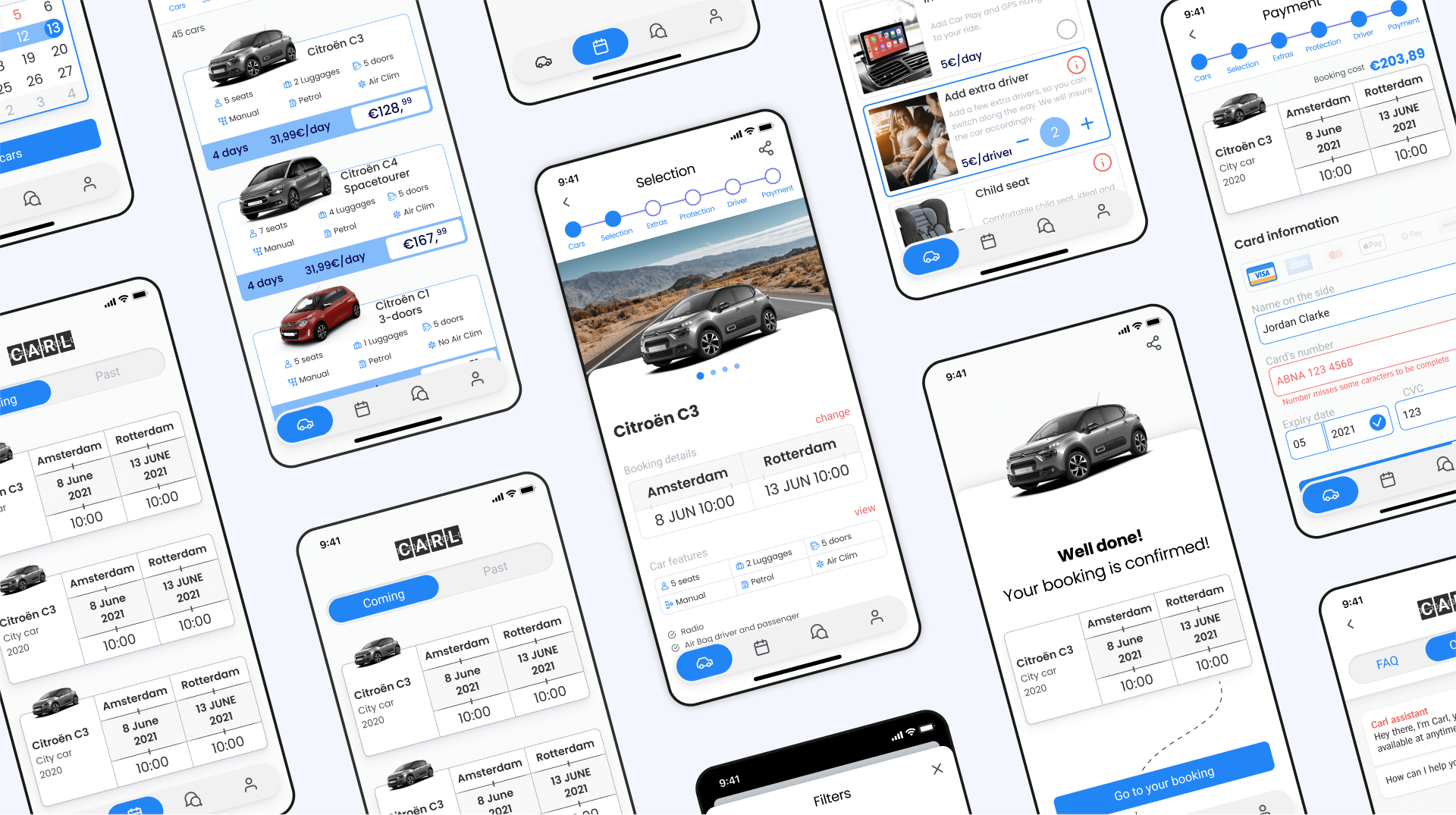
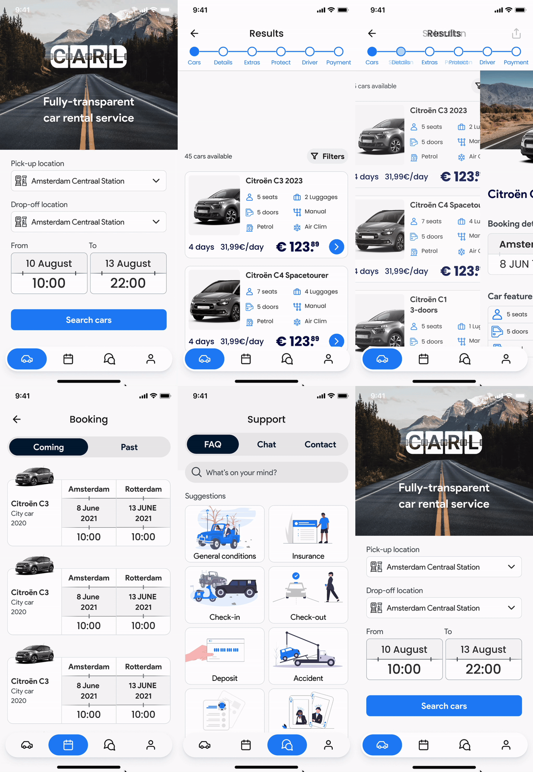
CARL is a mobile app that helps casual travelers rent vehicles with maximum clarity. From start to finish, the user has full control over their choice and the extras and can ask for service support at any time.
Competitive Benchmark
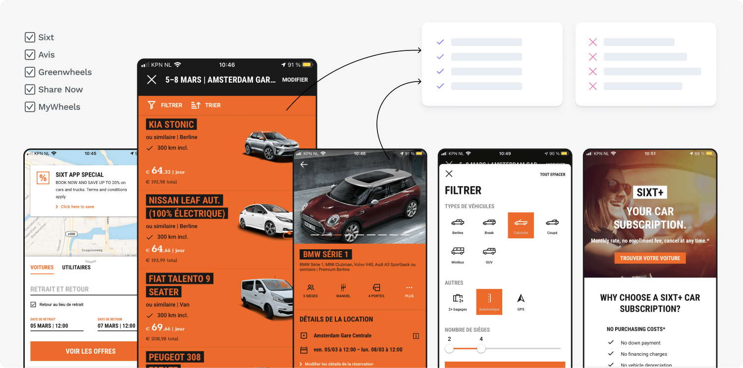
As a first step, I browsed various car rental apps to identify common patterns, best practices, typical user flows, and potential frictions to understand how these services function.
Usability test
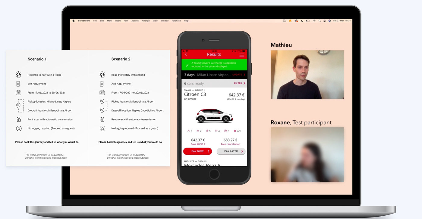
I then interviewed a potential user with a test script to gain insights into their mindset while renting a car.
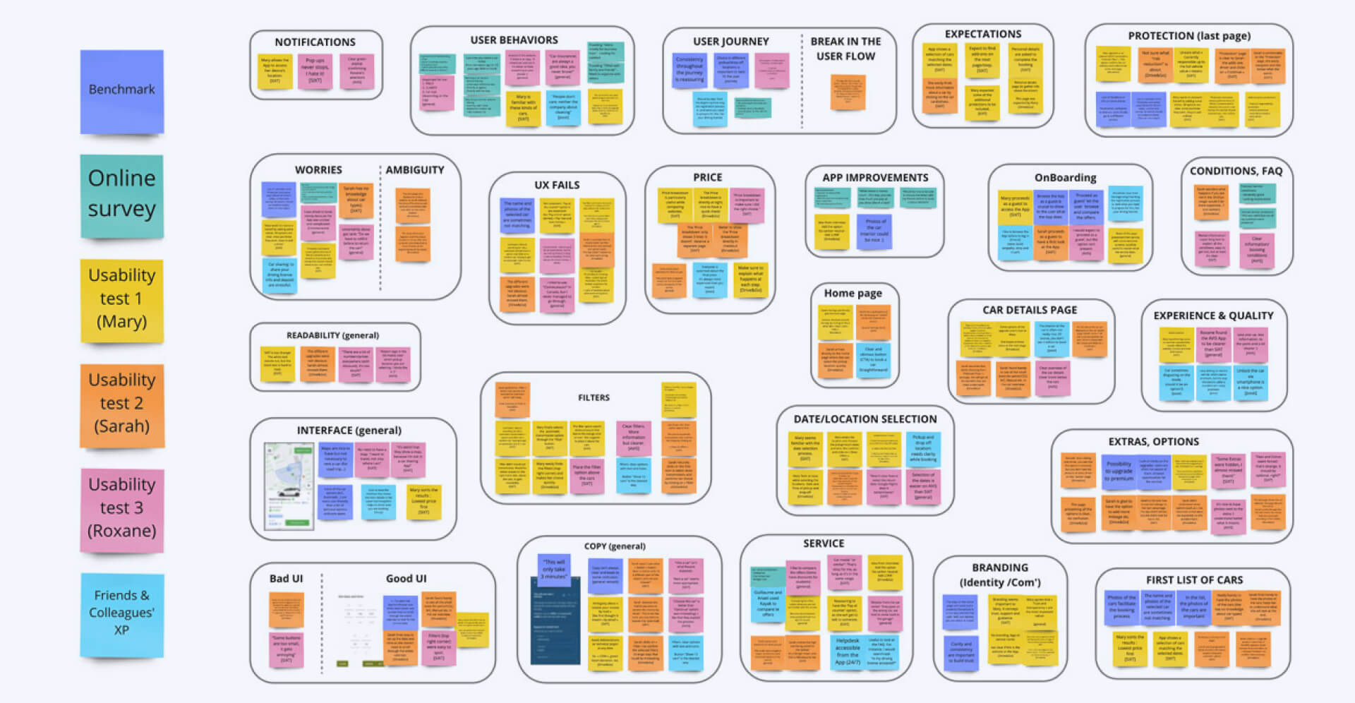
Affinity diagram
Organizing insights into key categories proved essential for creating the journey map. As I arranged sticky notes during a digital workshop on Miro, potential solutions and opportunities emerged.
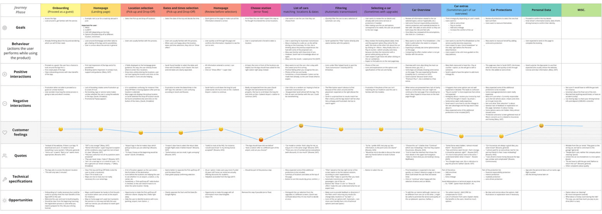
Customer journey map
Mapping a persona's user journey highlighted the need for a car rental app that better explains the booking process and guides users in selecting extras and protections.
Flow diagram

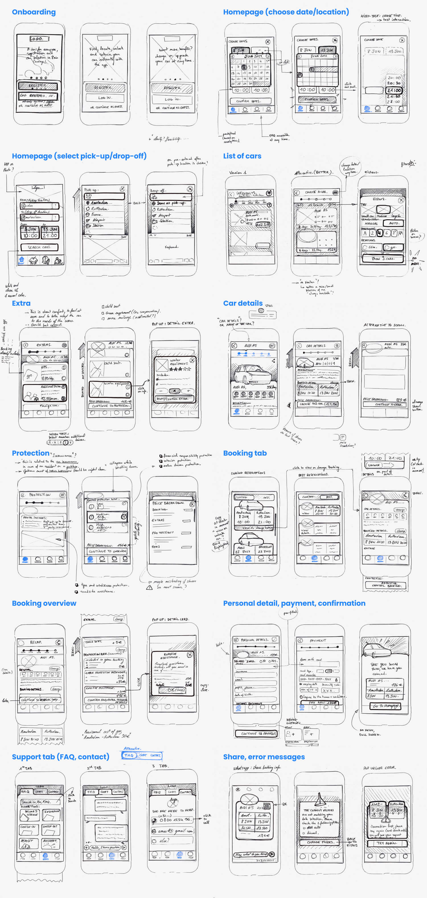
Interaction design
Sketching rough iterations of each screen on paper ensured that the elements translated to digital wireframes would effectively address the user pain points.
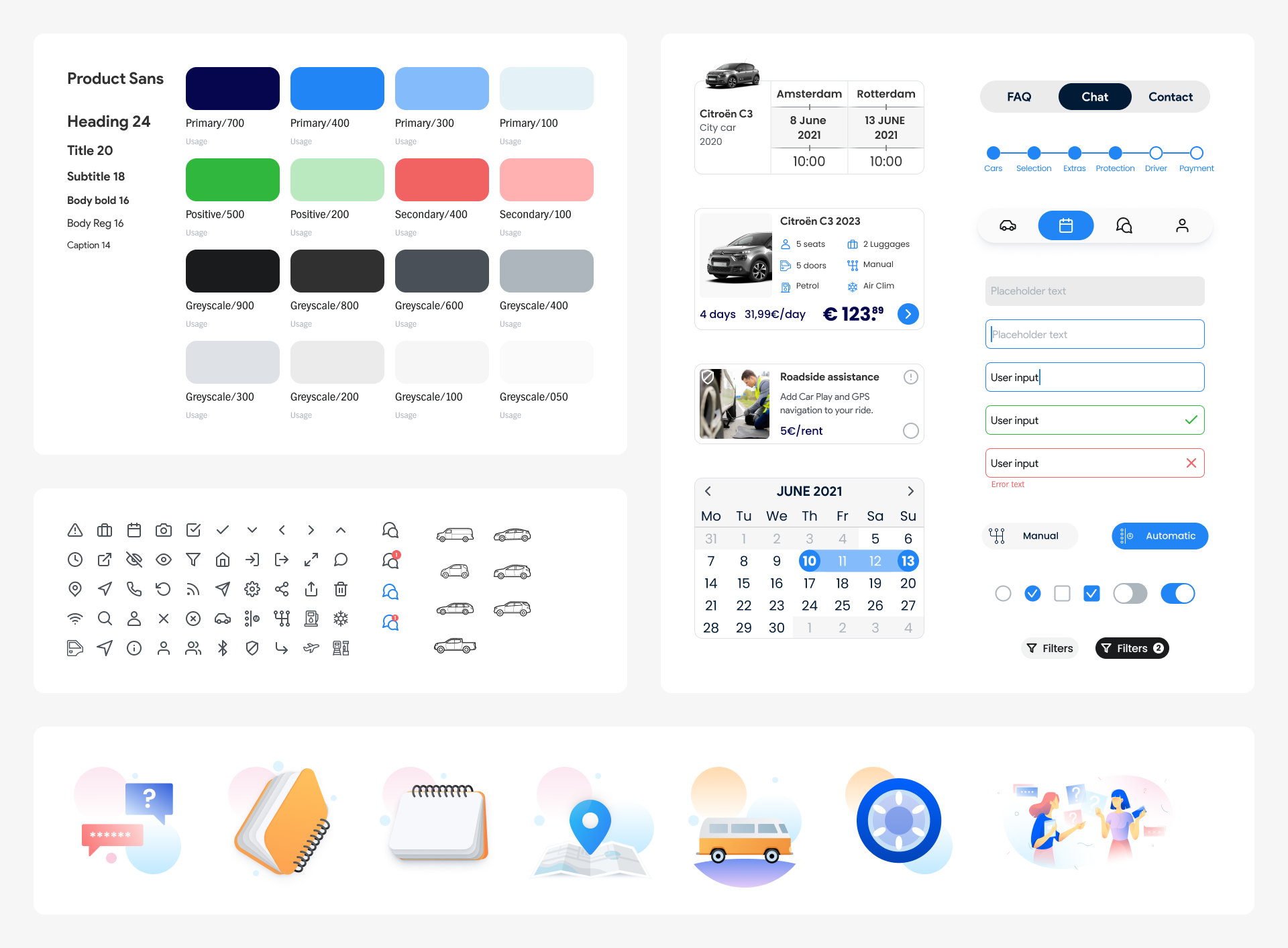
UI Foundations & Components
Hi-Fi Prototype
I built the prototype by focusing on the primary flow (booking a car) and experimenting with secondary flows (onboarding, profile, booking tab, and filters). Figma let me create the necessary interactions to test the app myself before involving real users for further testing.
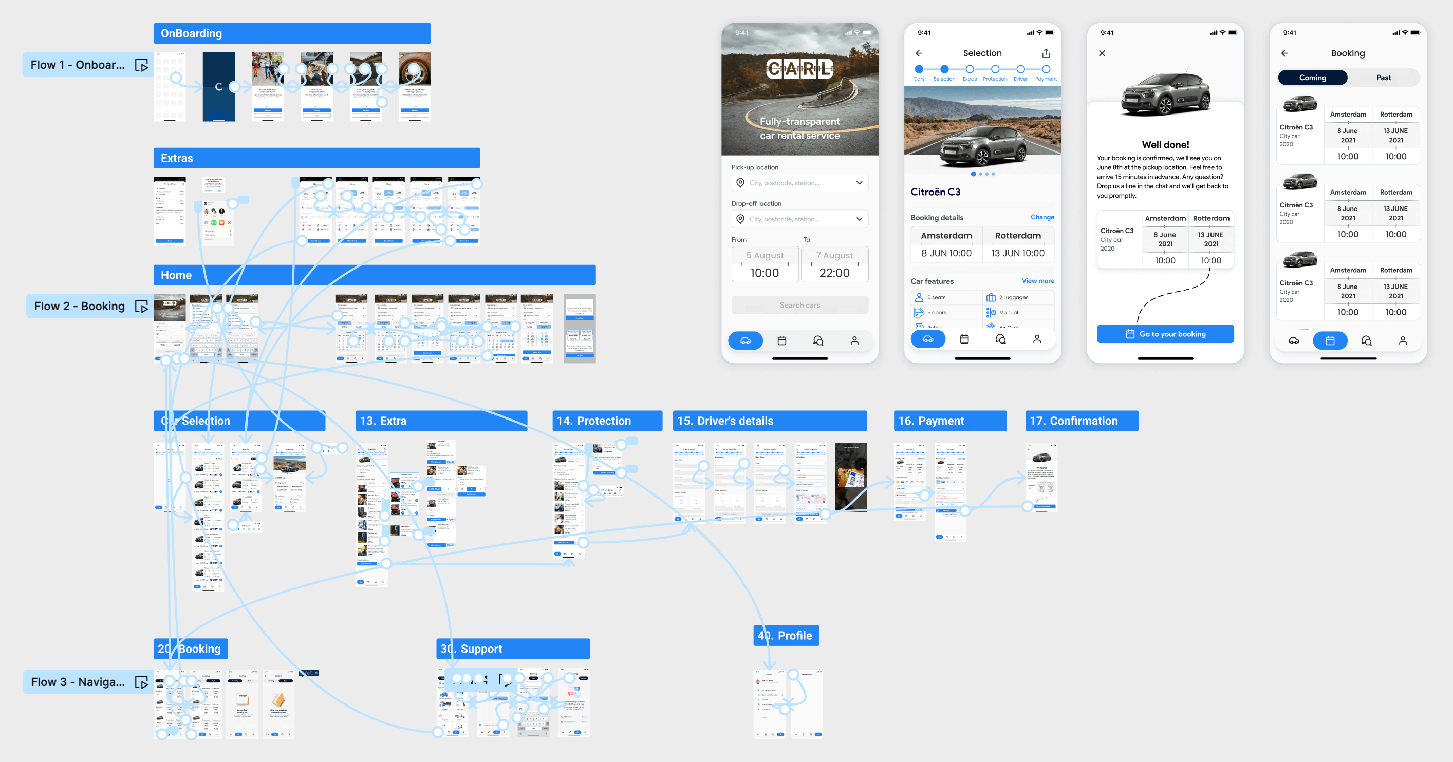
Sneak peak
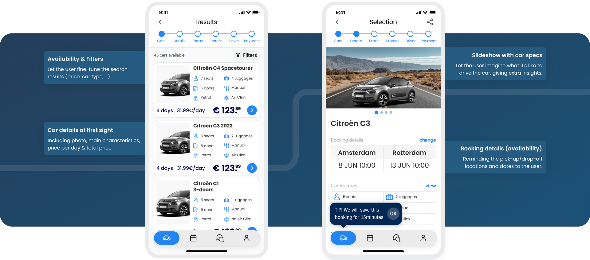
Result
